
Let’s be honest — undertones sound way more complicated than they need to be.
You just want to pick a paint color.
But suddenly people are saying things like:
- “That gray pulls blue.”
- “That beige is too warm.”
- “This white has a pink undertone.”
And you’re standing there like… it looks gray to me?
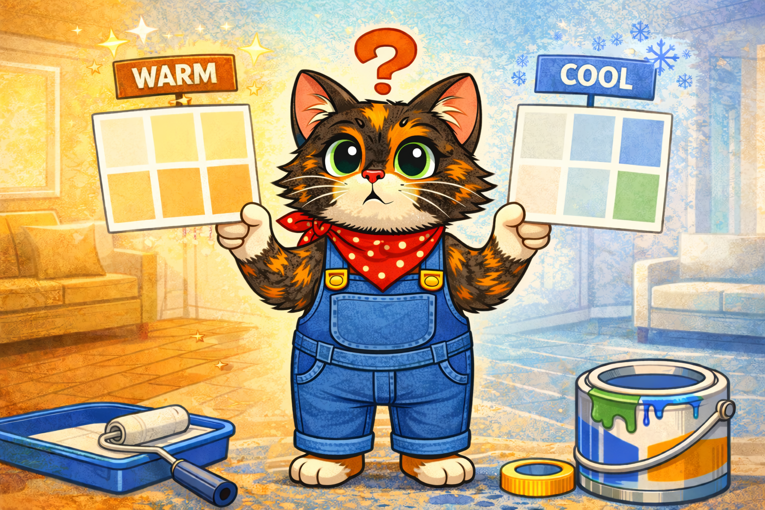
If that’s you — you are absolutely not alone. Let’s break down warm vs cool undertones in the simplest, most real-life way possible.
First: What Is an Undertone?
Think of a paint color like this:
- The main color = what you see first (gray, beige, white, blue, etc.)
- The undertone = the subtle color hiding underneath it
Undertones are the reason:
- One gray looks soft and cozy
- Another gray looks icy and modern
- One white feels creamy
- Another white feels crisp
Same “main” color. Very different vibe.
Warm Undertones (Cozy, Soft, Inviting)
Warm undertones lean toward:
- Yellow
- Red
- Orange
- Sometimes warm beige or cream
They tend to feel:
- Cozy
- Welcoming
- Soft
- Traditional
Examples:
- A gray with a slight beige or brown base (often called “greige”)
- A white that looks creamy instead of bright
- A blue that has a hint of green or warmth
Warm colors usually look best in:
- North-facing rooms (which naturally feel cooler)
- Spaces where you want comfort (bedrooms, living rooms)
Cool Undertones (Crisp, Fresh, Clean)
Cool undertones lean toward:
- Blue
- Green
- Purple
They tend to feel:
- Modern
- Clean
- Airy
- Bright
Examples:
- A gray that looks slightly blue
- A white that looks stark or bright
- A beige that leans slightly gray instead of yellow
Cool colors often look great in:
- South-facing rooms (which get warm sunlight)
- Bathrooms
- Modern spaces
Why Undertones Matter So Much
Here’s where beginners get tripped up:
Undertones change depending on lighting.
The same gray paint:
- Might look neutral in the store
- Blue in your hallway
- Purple at night
- Slightly green next to your flooring
That’s not you being dramatic. That’s undertones reacting to:
- Natural light direction
- Time of day
- Flooring color
- Cabinets
- Furniture
- Even nearby rooms
Paint is sneaky like that.
How to Tell If a Color Is Warm or Cool
Here’s the easiest beginner trick:
Compare It to a True White
Hold your paint sample next to a bright white piece of paper.
Ask yourself:
- Does it look slightly yellow or creamy? → Warm
- Does it look slightly blue or icy? → Cool
Or Compare Two Grays Together
Put two similar gray samples side by side.
Suddenly you’ll notice:
- One looks warmer (slightly brown or beige)
- One looks cooler (slightly blue or purple)
Undertones become obvious when compared.
The Gray Problem (Why It’s So Confusing)
Gray is the ultimate undertone trickster.
It can lean:
- Blue
- Green
- Purple
- Beige
- Brown
And you often won’t notice until it’s on your wall.
That’s why sample testing is so important. Paint a large swatch (at least 12×12 inches) and look at it:
- Morning
- Afternoon
- Evening
Undertones show themselves over time.
Warm vs Cool: Which One Should You Choose?
There’s no “right” answer — just what works in your space.
Here’s a simple way to decide:
Choose Warm If:
- Your flooring is warm-toned (oak, honey, red wood)
- Your furniture leans beige, cream, or brown
- You want cozy and inviting
Choose Cool If:
- Your flooring is gray or very dark
- Your decor leans black, white, chrome, or modern
- You want fresh and clean
The key is coordination, not perfection.
The Lighting Factor (This Changes Everything)
Room direction matters more than most beginners realize.
- North-facing rooms = cooler light → warm paint often balances it
- South-facing rooms = warm light → cool paint can prevent it from feeling too yellow
- East-facing rooms = warm in morning, cooler later
- West-facing rooms = neutral early, very warm at sunset
This is why a color that looked perfect online can look “off” in your house.
The Most Important Beginner Rule
Never choose a color based on the tiny paint chip alone.
Always:
- Test samples on your wall
- View them at different times of day
- Compare at least two similar shades
Undertones are subtle — until they’re covering your entire room.
The Encouraging Truth
If you’ve ever painted a room and thought:
“Why does this look purple??”
“Why does this white look yellow?”
“Why does this gray feel cold?”
Congratulations. You’ve officially experienced undertones.
You’re not bad at choosing paint.
You’re just learning how color really works.
And once you understand warm vs cool undertones?
Picking paint becomes way less mysterious — and way more intentional.
Leave a Reply