
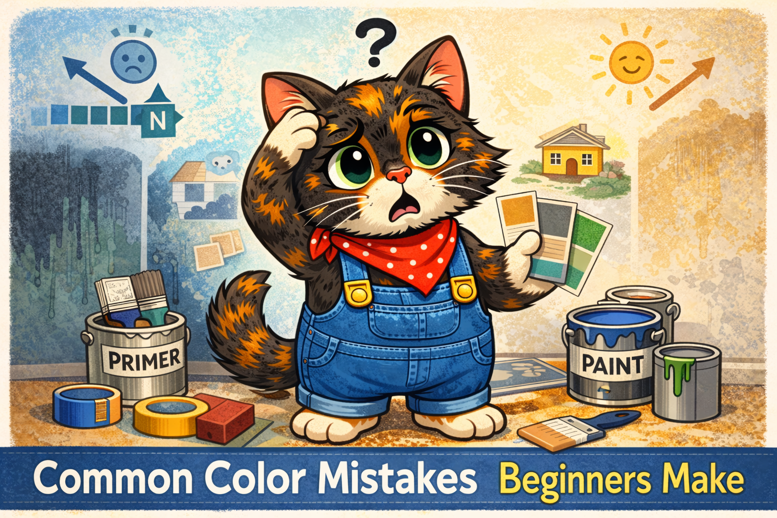
Let’s talk about something we’ve all done at least once:
You pick a paint color in the store.
You feel confident.
You get it home.
You paint it on the wall…
…and it looks completely different.
Too blue.
Too yellow.
Too dark.
Too bright.
Not what you pictured at all.
If that’s happened to you, welcome to the club. Choosing color is one of the hardest parts of painting — especially when you’re just starting out.
Let’s walk through the most common beginner color mistakes (no shame here) and how to avoid them next time.
1. Choosing a Color Based on a Tiny Paint Chip
This is the biggest trap.
Paint chips are:
- Small
- Viewed under store lighting
- Surrounded by dozens of other colors
Colors behave very differently when they cover an entire wall.
A soft beige chip can suddenly feel very yellow.
A light gray can suddenly look blue.
A muted green can feel neon.
What to Do Instead:
Always test samples on your actual wall. Paint a large swatch (at least 12″x12″) and look at it throughout the day.
Morning light and evening light can completely change how a color feels.
2. Ignoring Undertones
You think you’re picking “gray.”
But you’re actually picking blue-gray. Or green-gray. Or purple-gray.
Undertones are sneaky.
They show up depending on:
- Your lighting
- Your flooring
- Your cabinets
- Even your furniture
That’s why a gray that looked perfect online suddenly feels icy or muddy in your space.
What to Do Instead:
Compare similar shades side-by-side. Undertones are easier to see when colors are next to each other.
3. Going Too Dark Too Fast
Dark colors are beautiful. Dramatic. Cozy.
But beginners often underestimate how intense they’ll feel once the whole room is painted.
A moody navy can make a small room feel smaller.
A deep green can dominate the space if lighting is limited.
What to Do Instead:
Test dark colors on multiple walls first. And consider using them as accent walls if you’re unsure.
4. Trying to “Play It Safe” With Beige
On the flip side, many beginners panic and choose the safest neutral possible.
And sometimes… it just looks flat or lifeless.
Safe doesn’t always mean right.
What to Do Instead:
Look at the rest of your room:
- Warm wood floors? Try warm neutrals.
- Cool tile? Lean cooler.
- Lots of natural light? You have more flexibility.
Let the room guide you.
5. Forgetting About Lighting Direction
Room direction matters more than most people realize.
- North-facing rooms = cooler light
- South-facing rooms = warmer light
- West-facing rooms = warm evening glow
- East-facing rooms = warm mornings, cooler afternoons
The same color can feel completely different in two rooms.
What to Do Instead:
Test samples and check them at different times of day.
6. Not Considering the Finish
Color isn’t just about hue — sheen changes how it looks.
Higher sheens (satin, semi-gloss):
- Reflect more light
- Look brighter
- Highlight imperfections
Flat or matte:
- Soften color
- Hide flaws
- Feel more muted
Sometimes the “wrong color” is actually the wrong finish.
7. Choosing Based on Trends Alone
Trendy colors are fun.
But if you don’t love them in your space, you’ll feel it every time you walk into the room.
What looks amazing on Pinterest might not work with:
- Your lighting
- Your flooring
- Your personal style
What to Do Instead:
Use trends as inspiration, not instructions.
8. Skipping Sample Testing Because You’re “Pretty Sure”
We’ve all done this too.
“I’m confident.”
“It’ll be fine.”
“I don’t need a sample.”
Famous last words.
Skipping a $5 sample can lead to repainting an entire room.
9. Forgetting Adjacent Rooms Matter
Paint doesn’t exist in isolation.
If your hallway is warm beige and your living room is cool gray, they can clash — even if both colors are nice individually.
What to Do Instead:
Look at how rooms flow into each other. Colors don’t have to match, but they should coordinate.
10. Expecting Paint to Fix Everything
Color can transform a space — but it won’t fix:
- Bad lighting
- Clutter
- Poor prep
- Uneven walls
Sometimes beginners blame the color when the issue is actually surface prep or lighting.
The Encouraging Truth
Color mistakes are part of learning.
Even experienced painters:
- Test samples
- Second-guess choices
- Adjust along the way
Choosing paint color isn’t about being perfect.
It’s about:
- Testing
- Observing
- Adjusting
And once you understand how lighting, undertones, and finish interact?
You stop guessing — and start choosing intentionally.
Leave a Reply